
Along the Coffee Belt by Smells like Team Spirit
Project Summary.
Our primary purpose is to help people learn more about the coffee we drink. Most people drink coffee without knowing much about the substance and plant itself. The app that we created through R Shiny uses effective visualizations to display the complex relationships between coffee and the different variables that affect its growth. Moreover, the app shows the details of coffee around the world, mainly along the Coffee Belt, which is located between latitude lines 25°N and 30°S. It can also be used as a research tool for coffee data analysis for individuals who wish to learn more about coffee.
End Product.
Overall, our app contains four data visualizations and one fun coffee trivia game:
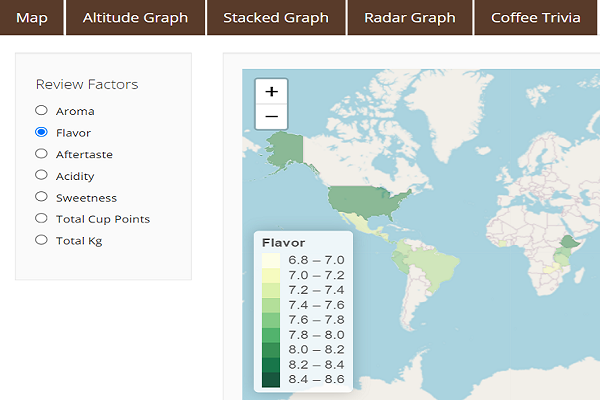
- A choropleth map displaying a country’s coffee quality categories that we can choose on the left.
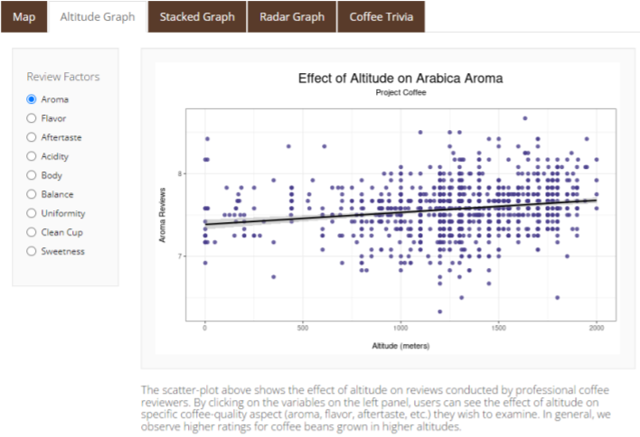
- A scatter plot highlighting the relation between altitude and quality categories.
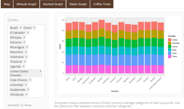
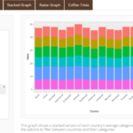
- A stacked bar graph showing each country and their average quality points.
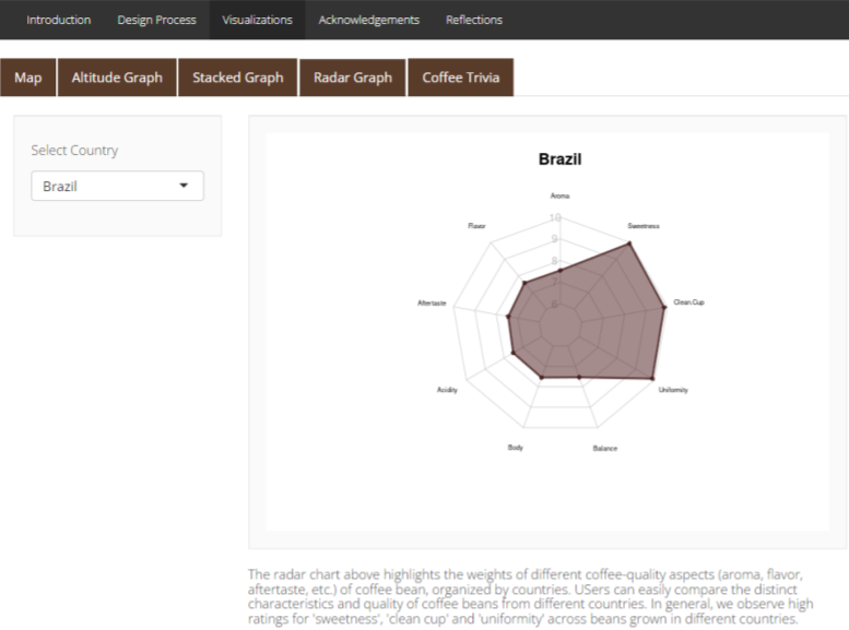
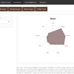
- A radar chart exhibiting each country’s quality category points.
- An interactive and fun trivia where users can learn and test their coffee knowledge.
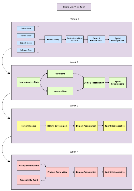
We began our project by mapping out all of the components in a timeline using a process map. We broke the project up into 4 weeks and created a visual diagram showing what we would accomplish each week. We didn’t end up sticking to this timeline exactly, but it provided us with a structure to follow. We spent Week 1 making the process map, finding our dataset, and planning for the remaining weeks. During Weeks 2 and 3, we planned out how our app would function, what visualizations we would use, and started development. In Week 4, we finished the development of the visualizations as well as the rest of the app and documented the project.
-
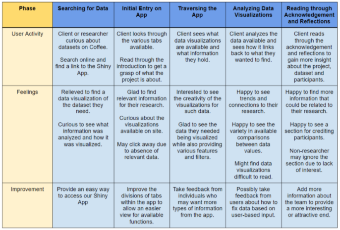
- An important step in week 2 was creating a journey map. This table maps out how we expect our users to interact with the app, their feelings along the way, and types of improvement we can make to the app. We defined our target users as researchers or other individuals curious about exploring data on coffee, and we mapped out how their interactions with the app can help them learn about the dataset and gain insight about coffee.
-
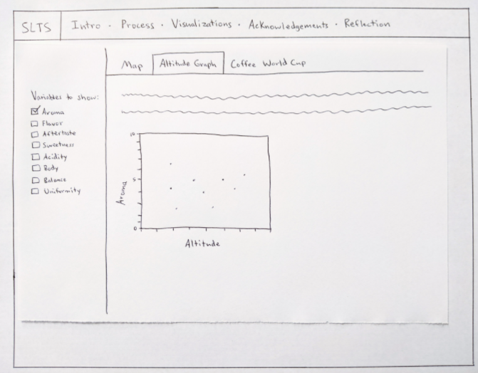
- Also in Week 2, we created wireframes to roughly sketch out what we wanted our app to look like. The image above is of the wireframe for one of the data visualization tabs. We drew the wireframes on paper, and they show the way we wanted to lay out text, images, visualizations, and interactive elements on the different screens of the app. We broke the content of the app into the five outer tabs, and then we added a sub-tab for each visualization under “Visualizations”.
The next step was creating the screen mockup. We originally planned to complete this during Week 3, however, we were able to do it ahead of schedule, in Week 2. In the screen mockup, we took the structure and layout from the wireframes and mocked up what we wanted them to visually look like. We chose a color scheme, laid out the text, and added images to make the mockup look similar to our plan for the finished app.
Overall, the project was a valuable learning experience for all of us not only because we had no prior knowledge about coffee and/or coffee beans, but also it was an opportunity to create a web application using R Shiny. We learned a lot about coffees from the data exploration process and analyzing the coffee quality reviews. To fill in the gaps in specific domains of knowledge, we also read various published literature and consulted an expert in the coffee industry. More importantly, we learned how to effectively use R programming to develop a Shiny app and deploy our final product on the web. The biggest challenge for our group was cleaning up the dataset in a format that we wanted. We realized that real-world datasets are not structured exactly as we would like to and that it requires significant time and effort to prepare the data. The challenge forced us to restructure and filter datasets and display them through different visualizations, which took our R-programming skills to the next level.
Acknowledgments
We would like to thank the following for their help with our project:
– Professor – Fernanda Eliott.
– Alumni Mentor – Cassie Koomijan.
– Data Publisher – Coffee Quality Institute (CQI).
– Data Source – Ankur Chavda.
– Coffee Quality Institute.
– Coffee Kaggle Dataset.