
CovidBot Explorer (CBE) by The ThunderCats team
Project Summary.
The CovidBot Explorer (CBE) utilizes cross-country data on robot usage in response to Covid-19 and RShiny to allow an individual at any level to visualize robot trends across the world. Along with these data, we retrieve macroeconomic and Covid-19 data from various sources to form a robust dataset, enabling more holistic visualizations. Our app includes an interactive map that displays statistics and rankings on various metrics for each country, a tab that visualizes and educates the user on the robot category operations, a tab which allows the user to see cross-region differences in robot usage, and, finally, a tab that allows the user to pick a country and see a wacky robot with design features related to that country’s statistics.
End Product.
Our project goal is to demonstrate the usage of robots across the world in solving issues related to Covid-19 through easy-to-understand visualizations; furthermore, we set a goal to create an application that was interactive, multi-functional, and enjoyable to use. Using RShiny front-end functionality, our product aimed to deliver modern aesthetics and UX for users at any level.
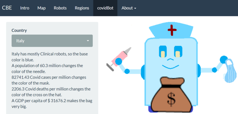
We purposefully made our application have easy-to-understand visualizations, like the covidBot and map tabs, and higher-level visualizations, like the robots and region tabs, so that any user can learn something from our application. Our users can explore macroeconomic metrics, Covid-19 trends, and robot usage across the world in our map tab, visualize differences in usage of robots across regions in the robots and region tabs, or just look at a wacky robot for whatever country they are interested in.
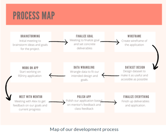
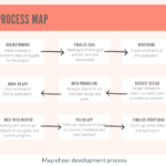
When starting the project, we created a journey map to better understand the steps we would need to take, as well as the amount of time we could allocate to each step of the process.
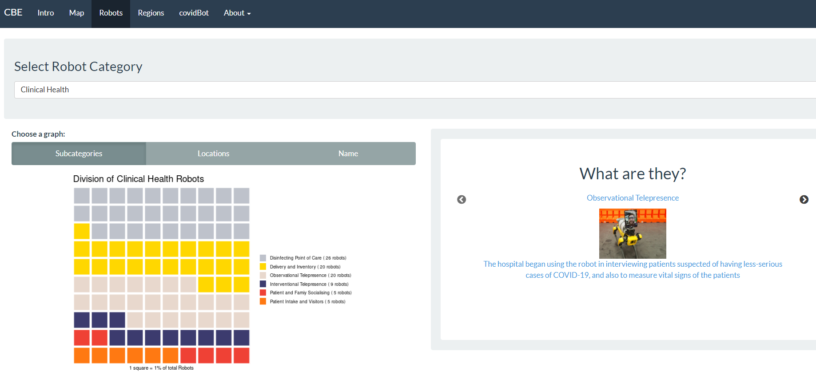
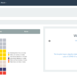
While working through our process map, we came across many challenges. Our first set of visualizations was criticized by classmates as being hard to understand; furthermore, when speaking to an alumni mentor, he believed our application needed to be more explanatory, so that anyone who opens the app can understand its use right away. After listening to these comments, we went to work. We made our visualizations more easily understandable by adding notes. By letting users know what each square represented, as well as the absolute value of robots in the legend, we had achieved our goal of making the app more easily understandable and explanatory. We set to further explain these robots by adding a “what are they” section to the app, that allows users to do further research on the various categories and subcategories of robots.
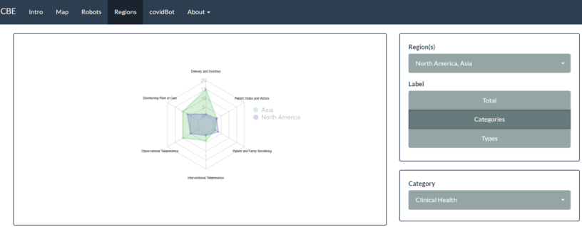
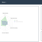
In this project, we wanted to go above and beyond by creating new and exciting visualizations that users may not be accustomed to and to give them the resources needed to see differences in data based on location. Generally, it is hard to meaningfully display categorical data. As you add more dimensions to a visualization, it also becomes increasingly difficult. After some research, we decided that our ideal interactive visualization with these challenges in mind would be a spider chart. At the end, we believe we overcame our challenges and provided meaningful visualizations to users at any level. Though we only described and included some visualizations here, our application has many more visualizations that can be created. We recommend you try it out for yourself and see what types of interesting stories you can tell from the data!
Acknowledgments.
- Professor Eliott. We would like to thank Professor Eliott for helping us throughout the entire development process and referring us to many resources.
- Alumni Mentor – Alex Leach. We would like to thank Alex Leach for giving us honest feedback and areas for improvement within our application, as well as his support throughout the design process.
- Everyone in the class. Finally, we would like to thank our software development classmates who gave us constructive feedback on our data visualizations.
- Robot Vector Inspiration.
- Robot data. Murphy, Robin; Gandudi, Vignesh Babu Manjunath; Trisha Amin, 2021, “Actual Use of Robots
for COVID-19 response”, Texas Data Repository. - Covid-19 data – Our World in Data.
- Macroeconomic data.
Packages.
- library(rsconnect) – RShiny requirement
- library(shiny)- RShiny aesthetics
- library(shinyWidgets)- RShiny aesthetics
- library(shinythemes) – RShiny aesthetics
- library(slickR) – RShiny aesthetics
- library(slickR) – RShiny aesthetics
- library(geojsonio) – data retrieval
- library(readxl) – data retrieval
- library(htmltools) – data retrieval
- library(tidyverse) – data manipulation
- library(eply) – data manipulation
- library(wordcloud2) – data visualizations
library(waffle) – data visualizations - library(fmsb) – data visualizations
- library(sp) – data visualizations
- library(leaflet) – data visualizations
- library(magick) – data visualization