
The Pursuit of Happiness
Project Summary.
The project is about finding how COVID has impacted global happiness ranking in the World Happiness Report. To get the difference in happiness scores before and after COVID, we compared the 2020 and 2021 World Happiness Report data because the yearly report from the World Happiness Report aggregates happiness data for three years. We created a Shiny App to illustrate the changes graphically so anyone can see how COVID impacted global happiness in different countries.
End Product.
Our audience is anyone interested in how COVID-19 impacted global happiness.
The app allows you to filter Happiness data based on region. It also allows you to choose measures of happiness based on GDP per Capita, Generosity, Perceived Corruption, Social Support, Life Expectancy, and Free Will. Based on the filtered items, we can visualize how countries’ Happiness ranking changed between years 2017-2020 and years 2018- 2021. Users can learn how happiness scores change in different countries based on region and what happiness measurements are used in the World Happiness data.
One of the interactive aspects of our app is choosing the different happiness measurements provided in the World Happiness data and updating the graph based on the user’s choices. For fun, we decided to create a page that shows how different latitudes impact happiness scores in different countries. We found that countries in higher latitude scored higher in happiness scores.
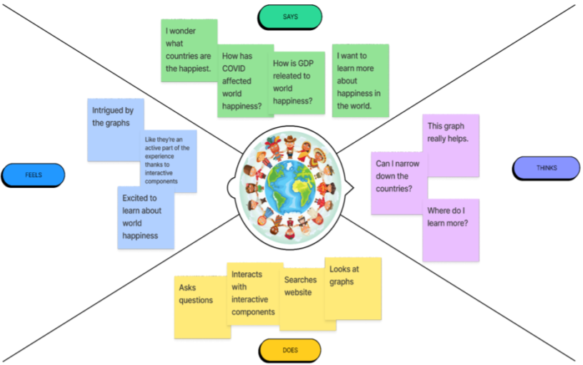
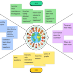
Our team first focused on creating an empathy map before we created an application. The empathy map helped us to consider what our users would want to see in the application, how the users would interact with the application, and feel about the result they have from using the application. We wanted the users who are curious about how COVID 19 affected world happiness and how GDP has an impact on world happiness. Also, we wanted the users to feel intrigued by the differences in happiness scores before and after COVID 19 by giving them interactive graphs to see the differences in happiness scores between the years 2020 and 2021 by selecting explanatory variables that users consider important.
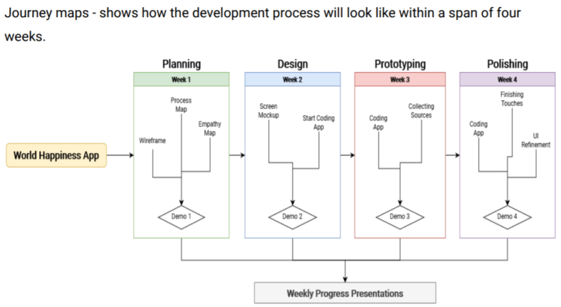
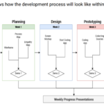
Our team then created a process map, the plan we have for our project. We planned the first week to be focused on understanding the users of our application. The second week to be focused on prototyping our application through wireframe. Third and fourth week to implement the application.
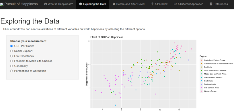
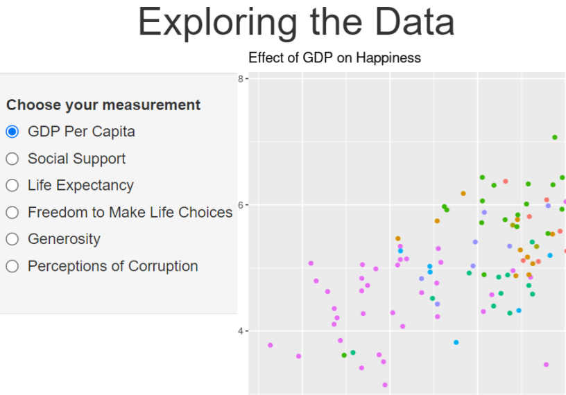
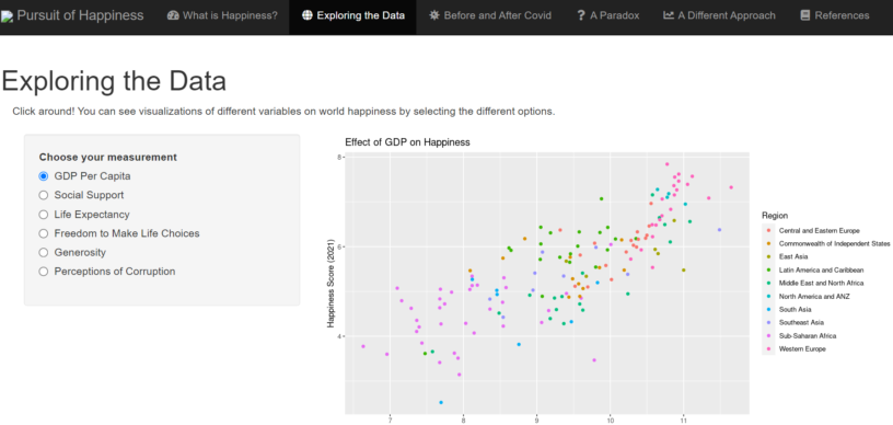
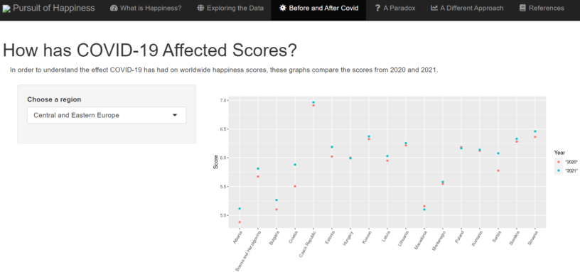
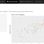
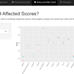
After four weeks of designing and implementing the application, our group could come up with a Shiny application. In exploring the data tab, we were able to make an interactive plot that reflects happiness scores by different regions in the world. Users can choose different explanatory variables such as GDP Per Capita, Social Support, Life Expectancy, Freedom to Make Life Choices, Generosity, and Perceptions of Corruption to understand how different variables in the World Happiness report data impacts happiness scores in different regions around the world. In the Before and After Covid tab, users can select a region they are interested in. Our shiny app displays the difference in happiness scores in different countries within the selected region to show if the happiness scores dropped or increased after COVID-19.
In the A Paradox tab, we wrote one issue we found in the World Happiness data about the suicide rate. After observing the data, we found that there is no evidence that shows that countries with higher happiness scores will have less suicide rates. It tells us that the suicide rate is not considered in the happiness score even though it is a very important variable. Lastly, we graphed the effect of latitude on happiness. We were able to find a trend that Western European countries seem to have very high happiness scores.
Overall, our team was able to learn about developing an R Shiny application collaboratively through Github. We also learned how happiness scores were calculated in the World Happiness data. After the project, we questioned if the variables in the World Happiness Report are appropriate to calculate the happiness score. If given more time, we are interested in knowing what variables are important to explain world Happiness and we hope to experiment to know how each variable impacts happiness scores in different countries.
Acknowledgments
We would like to thank Wesley Beary and Professor Eliott for helping our team shape The Pursuit of Happiness project. We would like to acknowledge the World Happiness Report for providing us with data to visualize happiness scores before and after COVID-19.
